What Trader Joe’s Can Teach Us
Last Saturday, I was feeling a little down and out so I went for a walk through the park. Consumer park, I should say. My jaunt took me to the epicurean part of Manhattan’s Chelsea neighborhood, better known as Trader Joe’s, where bohemians bustle in and out. Embraced by a horde of herbivores and gourmands alike, I barely had a moment to pause before gluttony jostled me to the side. I wondered why people would ever pay to go to the circus when they could observe such hysteria for free.
Meandering through the aisles, I gawked at 99-cent Israeli couscous, 100-calorie Belgian dark chocolate bars, and compact jars of artisanal jam. With no intention of buying anything (I had just suffered a particularly stressful trip to Chinatown for groceries that morning), I left with a recycled paper bag worth just over $30. And like that, I turned into one of the animals! Going mad, I went online and found the Trader Joes Fan Club ; surely, 530k+ fans can’t all be crazy?
My unscientific theory on why Trader Joe’s is so successful is that they understand humans really well. The secret, I believe, lies in 3 simple things:
1. Categories
2. Portioning
3. Presentation
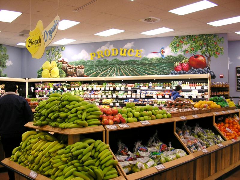
We love categories.
Things are easier to understand when they’re separated into chunks (similar to digestion). Trader Joe’s neatly stacks spices with spices, cereals with cereals, jams with jams etc. Other grocery stores do the same but it’s kind of messy. I’m certain Trader Joe’s invests in employees with good handwriting because the labels I’ve seen are works of art! (at least the ones in Manhattan)
In elementary school I couldn’t wait to come home after the first day to prepare my binders for the year. Labeling each Lisa Frank binder with its subject name, inserting dividers, then filing papers into their subsequent section was deeply satisfying. I think the excitement stemmed from the belief that everything had found its home. In due time, papers were thrown amuck but at least for the time being, it put me at ease.
Categories give us a sense of order. They make things easy. In life, nothing is ever easily pigeon-holed but a beautifully organized categorization system at a grocery store gives us all the peace of mind we need.
Don’t give ’em everything.
The invention of 100-calorie Weight Watcher snack packs (whoops they’re supposed to be meals?) was brilliant because it told us how much to eat. It alleviated the resource-heavy decision-making process that kicks in when we evaluate options. Deciding when to stop when your pleasure system says NO requires a huge amount of energy. So, not having to dip into that pool reserves our precious energy for more important decisions.
Similarly, Trader Joe’s understands that too many options can lead to shopping paralysis. Studies have found that buyers enjoy purchases more if they know the pool of options is not quite large. When given unlimited options, customers spend more time deciding what to buy rather than actually buying. On average, Trader Joe’s sells far fewer varieties of each item than a traditional grocery store. Less work AND more money for them!
Presentation
Depth does not appeal unless the surface frames it so. Plain and simple, we’re superficial. Trader Joe’s is not a food boutique but it’s a lot more inviting than a fly-infested fishy-smelling Chinatown market.
Chinatown prices are usually unbeatable but when your fellow customers are pushing you, produce is not neatly separated, and the floor always seems wet & slippery with who-knows-what…shopping is not a pleasurable experience. Contrast that with bright Hawaiian shirts, sparkling floors, and smiling employees – who cares if it’s all artificiality and chemicals – I’m happy and that’s all I care about.
I didn’t expect a UX lesson from an afternoon stroll in Trader Joe’s. But with 500k + fans and $8 billion in annual revenue, they must be doing something right! Companies like Trader Joe’s are setting standards for better user-centric design. As businesses like Fresh Direct and online shopping reduce the need to visit a brick-and-mortar, UX concepts like these will keep physical stores alive. Check out this article on how Kate Spade is using technology to improve the in-store experience for retail.
Takeaway
1. Categorize.
2. One thing at a time.
3. Frame it well.
Thanks, Trader Joe’s! (On a separate note, if you’re a fan of Nutella, I highly recommend Trader Joe’s Cocoa Almond Spread, my latest obsession. I dip it in everything. You can find a thorough evaluation, as it compares to Nutella, from one of many Trader Joe-inspired blogs: What’s Good at Trader Joe’s.)
Social Media decision-making design grocery stores trader joe's ux
